Intelligent Design: 5 Tips to Ensure You Never Lose Your Reader
"You Are Here". Three words that turn a sprawling city map into your best friend. Writers of successful tenders know that making documents easy to navigate puts the prospect at ease and creates a positive buying atmosphere.
KEY POINTS
- An easily navigable document creates a buying atmosphere
- Use navigational elements to tell the reader "You Are Here"
- Ensure easy PDF navigation with bookmarks and hyperlinks
With the reviewer relaxed, your proposal can convince and persuade without distraction.
Tender responses are rarely read cover to cover. In fact, Subject Matter Experts usually read only the parts relevant to them. Leaving a team of reviewers to stumble around a complex document is tender suicide!
The solution? Make your document easy to navigate so the reader can concentrate on the quality of the offer. It will suggest to them that beyond the printed page, your company is mindful of their needs and easy to work with.
Thankfully, making a document navigable isn't rocket science. Here are our top five tips to ensure you never lose your reader:
1. Include Consistent, Accurate Page Numbers
This may sound obvious, yet a frightening number of submissions fail here. One submission we reviewed had a large table of contents, but no page numbers in the footer: it meant that the reviewers had to count or flick pages to find what they were looking for. Unsurprisingly, the bid was unsuccessful.
Adding an automatically updating page number is very easy in a Word Processor or page layout application. When you do add them, make sure that they are placed within the printable margins of the page and that it works even for large numbers, if your submission is sizable.
If your document is to be submitted in PDF format, always check that the page numbers appearing on the pages match the electronic PDF pages - a mismatch can be very frustrating.
2. Provide a Table of Contents and/or Document Bookmarks
A Table of Contents (or TOC) may be the most-read page of your submission, and is often invaluable to a reviewer as it. As it is used like a master map to content, it needs to be accurate and helpful.
The size and complexity of the response will determine whether to use Sections and Chapters, or Headings and Subheadings. Usually, it's best practice to mimic the structure of the Request for Tender / Proposal (RFT/RFP).
For PDF submissions, providing a full set of nested 'bookmarks' is a great idea. It allows reviewers to quickly navigate the document with a few clicks. Adobe Acrobat Professional lets you customise the PDF so that the bookmark pane is available to the reviewer at all times.
Of course, it's sensible to double-check the accuracy of the TOC and bookmark links just before final submission.
3. Use Dynamic Headers, Footers and Margins
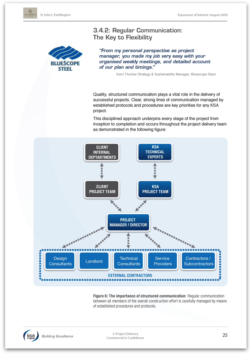
Headers and footers are valuable page 'furniture' which appear throughout your document. You can use them to provide essential 'You Are Here' information to the reader. The following example shows a submission with the RFT/RFP Reference and current section / chapter visible at all times:

Using subheadings in this way is an excellent way to ensure that even skim-readers grasp your messages. You can easily create dynamic labels which automatically update like these using a professional page layout program like Adobe InDesign.
4. Create Document Hyperlinks
If your submission document will be read electronically, hyperlinks are a must. These allow the reader to flick quickly between sections, references and related content with ease. If a table or reference page is referred to frequently, consider adding a "Back" button to the page to allow the reader to easily return to wherever they were prior to the link.
Naturally, as with all elements of your document, it is important to double-check all of the links prior to submission.
5. Include a 'How to Read This Document' Page
We've encountered few submissions that haven't been enhanced by the inclusion of this page. Providing a short instructional paragraph or two on the structure of the document and its navigational features is like putting out a welcome mat for the reviewer as they enter the world of your response.
As someone familiar with the document, creating a page like this will take you very little time and effort, but can make all the difference to a reviewer. Not only will they feel at ease, it demonstrates that even at this early stage, your company has their needs foremost in mind.
 Ensuring that your reader doesn't get lost is as easy as using the simple navigational techniques detailed above. And with the reviewer relaxed, your proposal can convince and persuade without distraction.
 Matt Milgrom is a principal consultant for Tender Success and has helped a brace of Australian organisations develop persuasive, reader-friendly tender submissions. Contact Matt to ensure your next response is a success.


